Los Ortiz dormían vestidos por si la casa ardía esa noche. Los Ortiz, o los Brennan, o los Washington, da igual, podría ser cualquier apellido, podría ser un apellido como el tuyo, exactamente igual que el tuyo. Vivían en South Bronx, en edificios de casi cien años, de fachadas de ladrillo con cuatro o cinco o seis plantas y ningún ascensor, y se acostaban con la ropa del día siguiente puesta, con los zapatos puestos, los niños sobre todo, porque bajar tres pisos en calcetines por una escalera en llamas podía suponer la diferencia entre vivir o morir. Las madres dejaban una bolsa junto a la puerta con documentos, una foto de la familia, el dinero en metálico que tuviesen disponible, siempre la misma bolsa, lista, como la gente que vive cerca de un frente de guerra. Porque, de algún modo, la década del fuego de Nueva York fue un frente de guerra.
Visa CMO Frank Cooper III is freshening up the company's look.
Jason Mendez/Getty Images for The Whitaker Peace & Development Initiative
Visa is rolling out a new "V" to pop on mobile screens as people move to contactless payments.
It's the company's first refresh of this size since 2021.
Other brands have increasingly leaned on symbols and pared-down names for better mobile visibility.
Visa is betting that less is more when it comes to how it shows up to customers.
Starting Wednesday, the letter "V" will replace "Visa" in the center of its credit cards and on its digital properties, the company exclusively told Business Insider.
Visa's move signals that after 50 years of using the name, it feels it has enough brand recognition to be represented by a single letter. The change is also meant to pop more on small screens as people conduct more of their lives on their mobile devices.
In addition to the "V," Visa is introducing a new font, called Visa Sans, lopping off the serif in the first letter of "Visa."
"V" will now stand in for "Visa."
Visa
The changes were developed by Visa's in-house creative studio and Base Design. It's Visa's first significant refresh since 2021, when it introduced a blue, white, and yellow flag-like brand symbol and a new font. With the new "V," that brand symbol will go away.
"There was an opportunity for us to modernize that and make it feel fresh, particularly for the next generation of consumers," Frank Cooper III, CMO of Visa, told CMO Insider. "We think it marries well with the evolution of the brand overall."
Cooper said the process took about a year.
"We do not have an awareness issue. We have deep trust. Playing around with the brand positioning is no light matter," he said.
Other big brands have increasingly leaned on symbols and pared-down names for better visibility on smaller screens.
Mastercard dropped its name from its logo in 2019. Google introduced a sans-serif logo and a new, four-color "G" icon in 2015.
Dan Nicholas, design director at creative studio Super Okay, said the move to a singular V aligns with a mobile-first approach that tech and media brands like Verizon and The New York Times have taken, in which they adopt a single letter as an icon.
He said the move simplifies Visa's appearance but could undermine brand recognition.
"What remains to be seen in the rollout is how Visa manages this new equity," he said. "If thoughtfully and strategically executed and invested in over the next few years, we can see it becoming a strong way for the brand to express itself."
Visa sees its visual changes as a companion to an effort to associate itself with culture and aspiration. It enlisted celebrities like Pharrell Williams for its "Power of Small Steps" campaign and has a partnership with the FIFA World Cup that extends through 2030. This year's World Cup campaign promoted its contactless payment option to emphasize that Visa's long-running slogan, "everywhere you want to be," was more than just a physical destination.
"We see that phrase now as representing both a physical destination and a personal aspiration," Cooper said.
Brazil spent years targeting electoral lies on the internet. Now, artificial intelligence is stumping the election authorities and reshaping a high-stakes race.
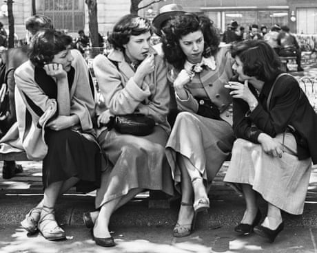
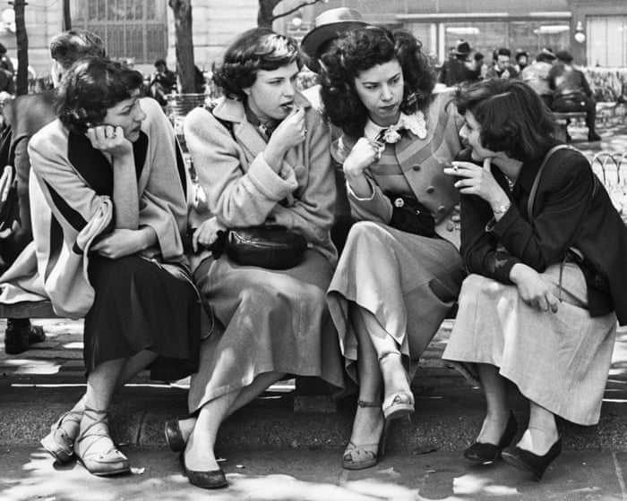
Little-known photographer John Baer captured everyday life before putting down his camera in 1954. His son discovered the images decades later after his death, and John Baer: The Extraordinary Ordinary / A Memoir in Photographs, 1945–1954 marks their first public release
Designing a kitchen that's comfortable and functional can be challenging.
John Keeble/Getty Images
We asked interior designer Lane Mari to share which design trends she'd never have in her kitchen.
The designer said she stays away from cheap appliances and synthetic materials.
She also avoids black hardware and harsh overhead lighting in favor of warmer materials and shades.
The kitchen is often one of the most-used spaces in a home, whether you're cooking for family or hosting friends.
With so much time spent there, the design choices you make can have a big impact on how the space looks and feels.
To help you avoid any kitchen-design missteps, Business Insider asked Lane Mari, an interior designer with experience in both design and construction, what she'd never have in her own kitchen and what she recommends instead.
Here's what she had to say.
Black hardware can stand out too much.
Black hardware can look harsh against lighter cabinets.
Tyler Smiley/Getty Images
When it comes to kitchen-cabinet pulls, Mari is skipping black hardware.
"It's too harsh and creates too much contrast on a white or light cabinet," Mari told BI.
If she wants something dark, she'll usually go for oil-rubbed bronze hardware instead. Its warm undertones can help make it look more balanced in a space.
Not all kitchens need an island.
A vintage piece of furniture can make a kitchen feel more elevated.
10'000 Hours/Getty Images
Though kitchen islands are popular, they don't work in every space — especially not in smaller or awkwardly arranged ones.
"It never looks good to have something crammed in that doesn't really fit," she told BI.
Before committing to an island, Mari recommends consulting with a designer to get its scale just right. In some cases, you might realize a traditional option isn't the right fit.
If that's the case, she said, you can try having a more open piece of furniture custom-made to better suit the space.
Leaving a small gap above kitchen cabinets can look unintentional.
Joe Hendrickson/Getty Images
Mari said she often sees cabinets that stop 2 to 3 inches below the ceiling, but it's not her preference. In many cases, it can look like a design mistake.
"If you have shorter ceilings, like 9 feet and under, you definitely want the cabinets going to the ceiling," Mari told BI. "That's going to make the ceiling look taller."
For taller ceilings, she said, cabinets can look best if they intentionally stop farther below the ceiling rather than leaving just a few inches of space.
You won't find an all-black-and-white kitchen in her home.
Joe Hendrickson/Getty Images
The designer loves color and incorporates it into her kitchen designs rather than sticking to a black-and-white palette.
Mari recognizes how challenging and overwhelming it can be to choose colors to incorporate into a home, but she has a few tips.
"The best place to get color inspo is from your own closet in the clothes that you wear," she said. Clothes that look good on you can look great in your house — and make you look good in your home, too, she said.
If your closet doesn't offer much inspiration, Mari suggests looking to favorite vacation spots or outdoor spaces instead. Though she gravitates toward natural colors, she said the shades you choose should ultimately make you feel most at ease in your home.
She skips synthetic materials in favor of natural ones that develop character over time.
Tfilm/Getty Images
When choosing materials for a kitchen, Mari opts for stone and wood over synthetic alternatives.
"Natural materials, although they might be a little bit more sensitive, wear better," Mari told BI.
She added that these surfaces can develop a patina over time, giving them more character as they age. On the other hand, manufactured materials don't tend to wear in the same way.
Countertops aren't an area where she'd skimp.
sheilasay/Getty Images
For this designer, high-quality countertops are worth investing in.
"If you're going for an elevated and high-end look in the kitchen, I suggest choosing the nicest natural stone that you can afford," she told BI.
Quartzite is one of her favorites for its strength and durability, and she also likes marble. She suggests visiting a stoneyard, choosing a stone that speaks to you, and designing the rest of the kitchen around it.
You also won't find her opting for the cheapest appliances.
Rick Madonik/Toronto Star via Getty Images
The designer said she often sees clients dealing with lower-priced appliances breaking or arriving damaged, which is why she recommends investing in quality when possible.
"Do your research and get the best ones that you can afford," she said.
For a higher-end look, the designer prefers to conceal appliances with panel-ready options integrated into the cabinetry. She also said retro-inspired styles are a more aesthetically pleasing alternative if integrated appliances aren't an option.
Too much overhead lighting can make a kitchen feel less cozy.
John Keeble/Getty Images
According to Mari, it is absolutely possible to have too much lighting in a kitchen.
She avoids track lighting and recessed lights, which can give off way too much light and make a kitchen feel more like an operating room, she said.
Instead, the designer prefers wall-mounted sconces, small lamps, or other forms of task lighting to provide "a warm and cozy vibe."
In addition, Mari recommends installing dimmer switches whenever possible to help set the mood and give you more control over the amount of light in the space.
Lastly, you won't see her jumping on kitchen trends unless they truly fit her vibe and needs.
Kseniya Ovchinnikova/Getty Images
There's nothing wrong with following the latest design trends, like colorful lighting strips under cabinets or mosaic-tile backsplashes, as long as you truly like them and they work for you.
"Every space is unique, and every family is different, and the best kitchen is the one that functions best for your needs," Mari said.
For her, designing a kitchen is about personalizing the space to fit each client's needs and lifestyle rather than following a trend simply because it's popular.
If she is going to hop on a trend in her kitchen, it's going to be because it suits her tastes and her lifestyle.
The late Christoph Schlingensief was one of German art’s great provocateurs. Can his B-Movie horror aesthetics still shock us into thinking anew about media power, colonialism, and the far right?
Christoph Schlingensief certainly knew how to provoke. “Fury at German play that shows Queen as a Nazi,” read the Sunday Express’s headline after Kaprow City first premiered at Berlin’s Volksbühne theatre in 2006. Drawing on the happenings of US performance artist Allan Kaprow, the play turned its attention to Diana, Princess of Wales’s death. In one scene, the then queen performs a Hitler salute. Another re-enacts the paparazzi chase that led to Diana’s fatal crash. Diana appears in bed beside two men with Down’s syndrome; and Camilla is pelted with animal blood. Schlingensief insisted the work was not meant as provocation but as an investigation into how Diana turned into a modern icon. But his art thrived on outrage, exposing the absurdity of societies that glorify their idols while consuming their lives as entertainment.
Kaprow City is at the heart of a new Berlin show – It’s Not My Problem Anymore, Deal With Your Own Shit – that revisits the artist’s legacy. In the Gropius Bau’s grand neo-Renaissance atrium, visitors encounter remnants of the carousel-like rotating stage he called the “animatograph”. Looking at this installation today feels like a glimpse into Schlingensief’s mind: a messy collage of childhood memories, violent fantasies and royal glamour.
Thaddaeus Ropac, London The artist captures horror, disgust and guilt over Germany’s Nazi past. The colossal results are so scathingly ironic it’s like being spat at
When the German painter Georg Baselitz died this year a chunk of Europe’s rapidly diminishing historical memory went with him. Baselitz was born in 1938, experienced Hitler’s Germany and the second world war as a young child, then found himself growing up in communist East Germany before escaping to the west and becoming an artist. His acidic, honest perceptions of the history he’d lived through will no longer be those of the living person I was lucky enough to encounter. But he has left us a gift: an exhibition in London he helped plan of his most astonishing history paintings, The Heroes.
It’s a savage, merciless vision of modern history with feelings of horror, disgust and irreparable guilt hanging heavy in the poisoned air. But there’s a terrible joy too, the thrill of speaking the truth. You sense the liberation Baselitz must have felt when he set brush to canvas to start these paintings in 1965. Comparing the explosive rage and nihilism of his art to punk may be inadequate but the title of this series of colossal imaginary portraits is so scathingly ironic it’s like being spat at.
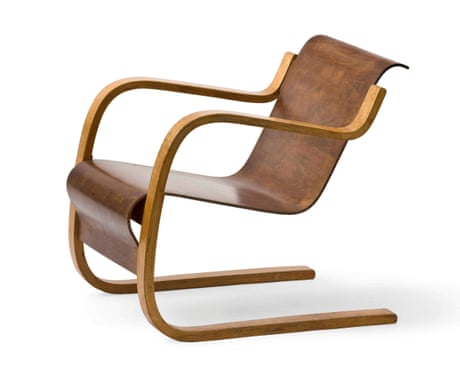
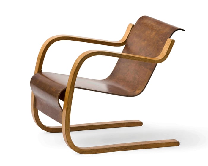
His egalitarian homeland used to harbour reservation against the architecture star. But with 13 new Unesco listings and a new exhibition in Helsinki, Aalto’s work is finally getting the recognition it deserves
In the early 1950s, Alvar Aalto built a boat to get to his remote summer residence on an island in Lake Päijänne, about 200km north of Helsinki. But the celebrated Finnish architect was not a happy skipper. He named the boat – a title as cumbersome as his buildings were elegant – Nemo propheta in patria: “No man is a prophet in his own land”.
The name was a dig at Finland, which the architectural maestro believed had taken him for granted. Other nations, he moaned, recognised his talent more than his own. Today, arriving in Helsinki, I find that Finland doesn’t just love Aalto, he’s a national treasure.
The European Commission unveiled its EU Kids Act on Thursday (17 September), proposing sweeping restrictions on children’s access to social media and new obligations on technology companies to address growing concerns over young people’s mental health and online safety.
The proposal would prevent children under 13 from accessing social media, while 13- and 14-year-olds could use restricted “mini accounts” under parental supervision. From the age of 15, teenagers would be able to open their own social media accounts. The legislation also requires platforms to prove their services are safe for minors, reversing the burden of proof from regulators to technology companies....
In the new print issue of Esses, a quarterly print magazine covering motorsports and the culture around it, Duncan Fyfe writes about the most bizarre Formula One video game ever made. Centered around Gerhard Berger, a former racing driver from Austria who competed in F1 from 1984 to 1997, Gerhard Berger’s Formula 1 Quiz is a quirky video game from 1993 that raises more questions than it asks. Fyfe digs into the mystery, investigating the quiz’s grammatically awkward questions and the game’s developer, Austria Soft, whose existence is questionable. (Esses subscription may be required—consider becoming a member.)
THE REAL QUIZ, it soon becomes clear, is not a test of one’s F1 knowledge, but figuring out what the game expects to hear. This only becomes more difficult, and even sinister. Question nine: FROM WHAT COUNTRY IS JEAN ALESI REALLY? The answer is not France, where Alesi was born and grew up, and under whose flag Alesi competed for over a decade. To progress in the quiz, the game forces one to submit that Alesi was born to Italian parents, and thus is “really” from Italy.
The game’s questions all have correct answers that cannot be submitted, and yet they are less difficult to answer than these ones: Who made this game? Why? And what was Gerhard Berger thinking?
“Most people don’t get to buy their old homes back, or ever step foot in them again, and that’s okay. But we sure can spend a lifetime trying to re-create them.” In this poignant essay for Dwell, Emilia Petrarca celebrates the work of her late father, the New York City architect John Petrarca, and explores how his influence has shaped her own relationship to home and interior design. Petrarca reflects on the process of finding her own aesthetic while carrying her father’s with her, considering the ways belongings and spaces can hold our memories, legacies, and grief.
When I moved out of my mom’s house and into my first apartment with a roommate at 23, I brought with me a black rug my dad bought in Morocco. After graduating from Carnegie Mellon, he joined the Peace Corps and spent time in Ouarzazate designing government buildings. In a room full of cheap Ikea furniture, it was the only thing that truly felt like a reflection of me. Well, that and a rigid, plastic, yellow outdoor chair I for some reason bought to go with my desk. Looking back at photos now, I see that the choice makes more sense: The chair my dad got me for my room in the Big House was almost the exact same hue.
I gioielli hanno sempre avuto un ruolo sociale e spirituale che va oltre la semplice decorazione estetica, poiché l’essere umano affida da sempre ai metalli preziosi il compito di raccontare storie intime e personali. Indossare al polso un bracciale, in particolare, rappresenta un gesto quotidiano carico di significato, un modo per tenere sempre sotto gli occhi un promemoria visivo dei nostri traguardi o delle persone che amiamo. I bracciali si muovono insieme a noi in ogni istante della giornata e diventano i custodi silenziosi di ricordi preziosi, capaci di evocare sensazionidi protezione, appartenenza e calore profondo ogni volta che li sfioriamo. Questa connessione così intima trasforma un semplice accessorio in un vero e proprio ponte emotivo, un filo invisibile che unisce il nostro mondo interiore alla realtà esterna, offrendoci la rassicurante certezza che i momenti più importanti rimangano impressi nella nostra quotidianità, pronti a risplendere sulla pelle giorno dopo giorno.
I simboli che parlano al cuore e l’evoluzione del legame eterno
Ogni piccolo elemento inserito in un gioiello parla una lingua universale fatta di forme e dettagli che richiamano concetti profondi come la forza, la speranza o l’amore autentico. Molto spesso sono proprio questi dettagli a determinare il reale valore affettivo di un oggetto, trasformandolo nel regalo ideale per ricordare una svolta importante del proprio cammino o un’unione speciale. Questa filosofia si riflette, ad esempio, nel bracciale della collezione Infinity di Kidult, dove l’idea di un legame duraturo non viene affidata a un semplice disegno sulla superficie, ma a una vera e propria scelta strutturale. L’accessorio si allontana così dall’essere un elemento decorativo temporaneo, offrendo un modo concreto per portare sempre con sé il significato di una promessa.
I materiali e il sistema di aggancio
La particolarità di questi bracciali si lega alla natura del loro sistema di aggancio e alla resistenza dei materiali. L’acciaio inossidabile garantisce una lunga durata nel tempo mantenendo intatta la propria lucentezza. La caratteristica fondamentale è però il sistema di chiusura non reversibile: una volta uniti i due lembi, il meccanismo interno si blocca in modo definitivo e l’unico modo per rimuovere il bracciale in futuro sarà quello di tagliarlo. Questa scelta elimina la necessità dei classici moschettoni, offrendo una linea pulita edessenziale, adatta sia a uno stile maschile che a uno femminile.
Un rito condiviso per sigillare una promessa indissolubile
Proprio per via della sua natura permanente, la scelta di indossare o regalare un bracciale di questo tipo si trasforma in un’esperienza unica che richiede una complicità consapevole tra chi lo dona e chi lo riceve. L’atto di unire le due estremità e attivare il bloccaggio d’acciaio diventa un piccolo rito condiviso, un patto silenzioso che unisce due persone in un momento indimenticabile di affetto sincero e reciproco. Che si tratti di celebrare un amore romantico, un’amicizia straordinaria che supera le distanze fisiche o un legame familiare profondo, questo oggetto si propone come il custode di un sentimento reale, destinato a brillare sulla pelle come una presenza costante che non teme affatto lo scorrere degli anni.
 Login